
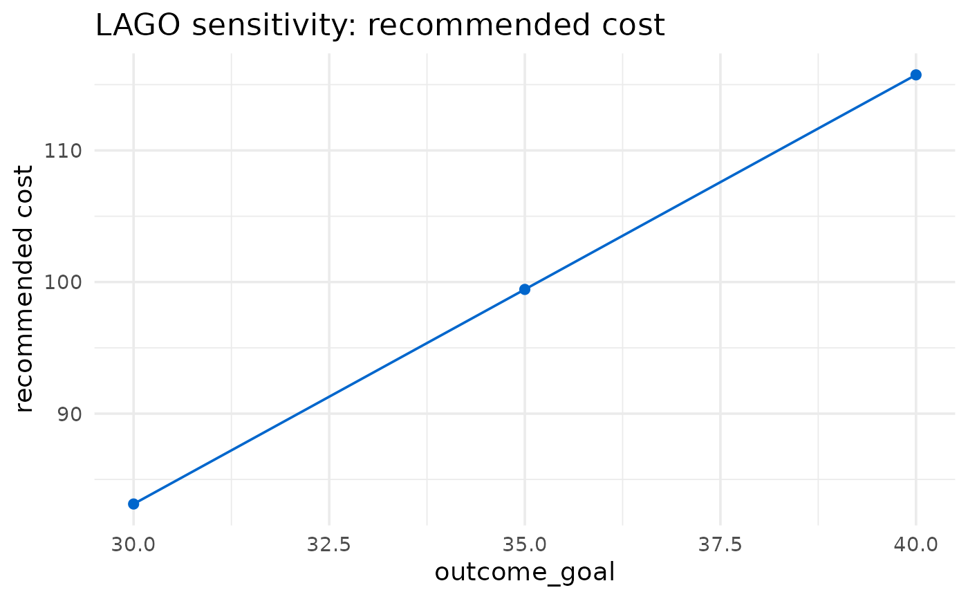
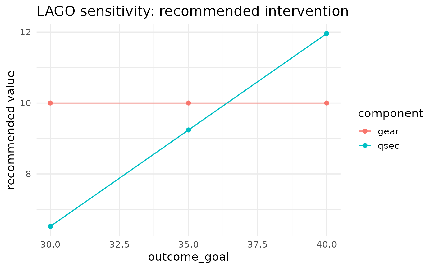
Draws the sensitivity curve with [ggplot2][ggplot2::ggplot]. By default (`show = "cost"`) it plots the recommended cost against the swept value as a line with points: for an `"outcome_goal"` sweep this is the cost-of-stringency curve, and for a `"cost_multiplier"` sweep it is a straight line. With `show = "components"` it instead plots the recommended value of each intervention component against the swept value, one coloured line per component. Rows with `NA` outputs are dropped with a message.
Value
A [ggplot2][ggplot2::ggplot] object, or `NULL` invisibly when `show = "components"` and no components are recorded.
Examples
# \donttest{
sens <- lago_sensitivity(
data = mtcars, outcome_name = "mpg", outcome_type = "continuous",
glm_family = "gaussian", link = "identity",
intervention_components = c("gear", "qsec"),
intervention_lower_bounds = c(0, 0),
intervention_upper_bounds = c(10, 350),
cost_list_of_vectors = list(c(0, 4), c(4, 6)),
outcome_goal_intention = "maximize",
parameter = "outcome_goal", values = c(30, 35, 40)
)
plot(sens)
 plot(sens, show = "components")
 # }
# }